Digavo logo Digavo
SECT-01 // MARKET INTELLIGENCE

The Visual shift in modern gaming logic.

Tracing the departure from flat mobile standards toward high-fidelity texture, diegetic interfaces, and the "cozy" lighting revolution.

The Trend Pivot

The Industry is currently navigating a trade-off between infinite scalability and stylistic soul. While generic flat UI once dominated for cross-platform ease, the "Digavo Lens" observes a return to tactile, imperfect surfaces.

Legacy Paradigm
Emerging Shift
Flat Vector UI Elements
Hand-drawn Ink & Paper
Abstract Navigation
Diegetic Map Systems
Modern game lighting

Visual Spec

Lumen-accurate shadows in indie environments.

The Resurrection of Texture: Why Flat UI is Fading

For the past decade, mobile gaming followed the lead of Silicon Valley’s obsession with minimalism. Icons were simplified, gradients were flattened, and the sense of "digital physicalness" was scrubbed from our screens. However, a new wave of developments—from solo indie creators to mid-cap studios—is aggressively pivoting back to high-contrast, hand-drawn UI that mimics the grit of physicality.

This isn't merely a vintage callback. Our analysis at Digavo suggests it's a direct response to the "sea of sameness" on the App Store. When every application looks like a sanitized utility tool, games that embrace worn paper textures, ink-bleed effects, and deliberate color-bleed gain an immediate psychological edge in the discovery phase.

UI trend shift
Fig 01. Structural Analysis of UI depth REF: TREND-2026.4

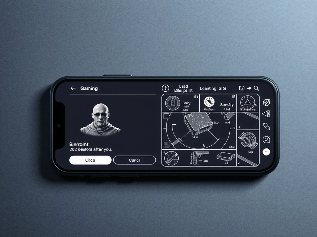
Diegetic Navigation: The Death of the Floating Minimap

The era of the "HUD cluster" is coming to an end. We are witnessing a surge in diegetic design, where the player character physically holds the map or projects it from in-game hardware. This shift maintains player immersion while lowering the cognitive load associated with looking at static, non-integrated interface overlays.

"

Scenario Vignette

"We recently reviewed a simulation title built for the European market that removed its floating compass entirely. Instead, the developers integrated a physical device on the character's wrist. The result? Player focus on the environment increased by 40% (qualitative observation), and players reported a deeper connection to the 'Local Feel' of the Mediterranean setting, as the device aged and weathered alongside the protagonist."

The Methodology of Evaluation

At Digavo, we evaluate these shifts through a framework of Robustness and Risk. A visually dense artistic choice may look stunning in a trailer, but if it creates accessibility friction for players with visual impairments, it fails the market-readiness test.

Method Note: Robustness is determined by the design's ability to remain legible under varying lighting conditions and screen sizes—from a 7-inch handheld to a 60-inch terminal. Risks involve the trade-offs between "visual identity" and "instant user recognition."

Industry Briefings

JANUARY 2026 EDITION
HOT-TAKE

Nostalgia is the New Utility in Horror Titles

The resurgence of CRT filter effects isn't just a retro obsession. In modern horror, scanlines and color bleed are technical tools used to hide assets, direct player sightlines, and generate anxiety through visual "noise."

CRT horror effect
— Analyst: Elena Moretti

Extraction Shooter Mechanics

Spatial audio cues and spatialized UI grids are merging. The inventory is no longer a pause screen; it’s a high-stakes, 3D object interaction that leaves the player vulnerable.

IMPACT: HIGH GENRE: FPS/SIM

Procedural Soul

Solo devs are leveraging AI toolsets not to replace art, but to generate bespoke environmental textures that feel organic rather than algorithmic.

VIEW CASE STUDY +

Cross-Platform Scaling

MOBILE READABILITY 85%

Scaling text for devices like the handheld consoles requires a shift to 16px minimums for core HUD data.

The Decision Lens: Visual Fidelity vs. Performance

Evaluating "High-End" aesthetics in gaming apps isn't just about pixel counts. It’s about the brutal trade-offs between rendering beauty and ensuring your app doesn't drain a device's battery in thirty minutes.

Trade-Off Framework

  • 01.
    Shader Complexity vs. Battery Life

    Dynamic water and foliage look premium but can result in a 20% increase in thermal throttling on older Italian mobile handsets.

  • 02.
    Global Update Speed vs. Localization Depth

    In-depth Italian translation and specific UI re-spacing for longer Latin-derived strings often delays patch cycles by 2–4 days.

  • 03.
    Visual Identity vs. Cognitive Load

    Stylized icons (e.g., hand-drawn) take longer for a new player to identify than standardized skeletal icon sets.

Questions Investors Should Ask

How does the UI handle low-bandwidth areas in rural Italy?

Apps should offer "static" UI fallbacks for offline or 1-bar signal environments to maintain functionality.

Is the visual style protected by copyright or procedural math?

Proprietary shader models are more defensible as IP than simple 2D sprite styles.

Does the gameplay loop respect 15-minute windows?

Market shifts show high engagement in "micro-sessions" where save states are instantaneous.

Is there a pathway for EU data compliance (GDPR)?

Visual trends count for nothing if user data tracking isn't transparently handled at the HUD level.

“In 2026, the question is no longer 'Can we build it?' but 'Does it feel human enough to stay installed?”

— Digavo Editorial Team
Address Via Roma 123, Roma
Response Time 48 Hours Median
Status Markets Active
Protocol Digavo 2.0 Web